Bright is a concept company that inspires new ways to learn skills by combining big ideas with an easy-to-use interface. Their main product is an app that you can use wherever you are and implements their cloud technology. This project was inspired by a goodbrief.co brand identity design brief. The brief did not provide a company name so I had to think of something that I felt fit best for the application.
Animated Logo, created using Adobe After Effects
LOGO ICONOGRAPHY: WHY?
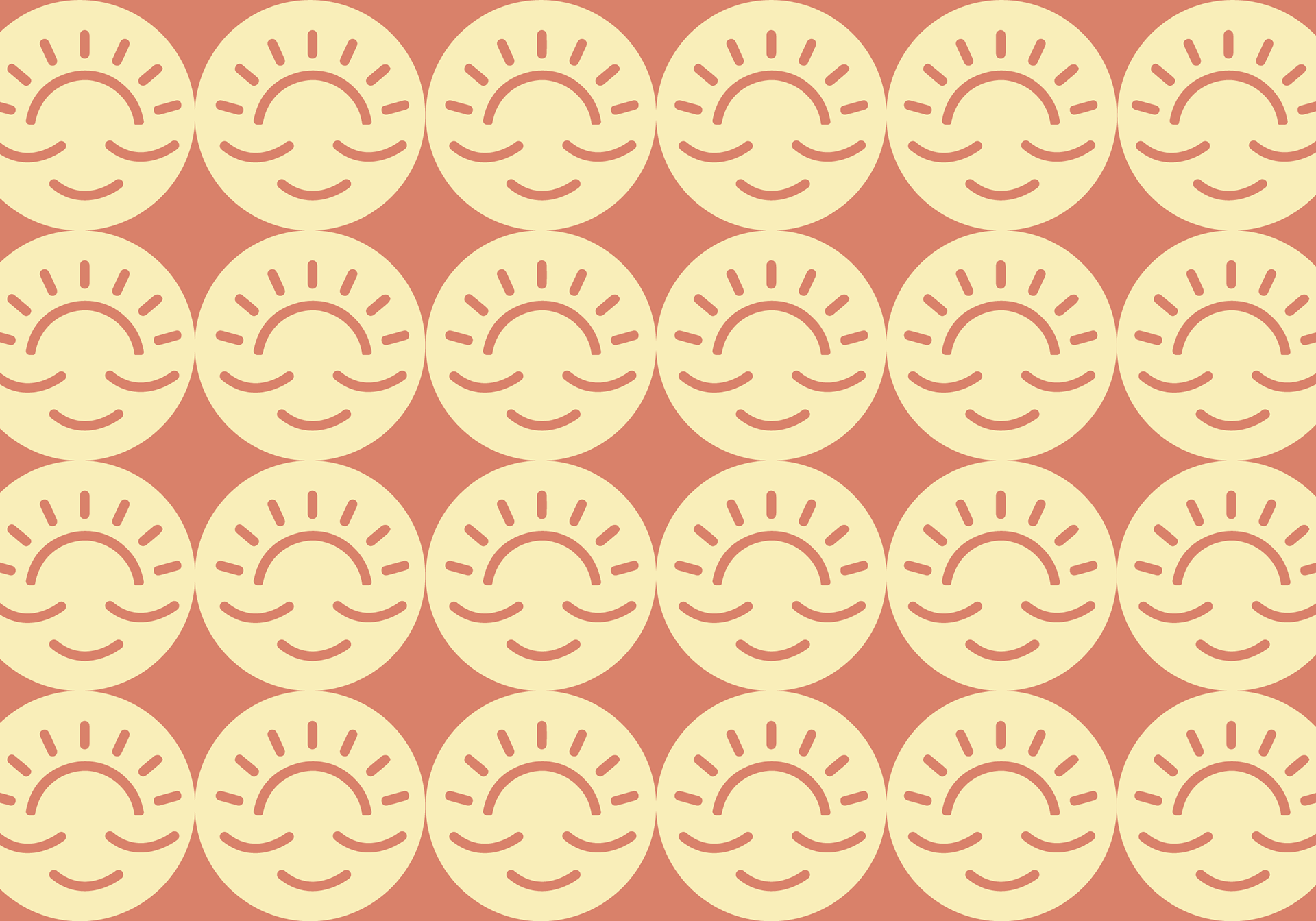
I decided to use a logo-mark, a word-mark, and a combination mark for a wide variety of logo application usage. The "Bright" sunset logo-mark is a play on the brand name "Bright" The three lines below the sunset not only create a delighted face but also symbolize the bottom of a cloud - A reference to the cloud technology the app uses. The logo-mark was designed for scalability, allowing it to be applied in various ways across multiple mediums, digital and/or print.
COLOR PALETTE: WHY?
The BRIGHT color palette was meticulously chosen to convey a down-to-earth feeling of warmth and delight. Because people tend to associate earth tones with stability, coziness, and warmth; It is a common theme to see them being used in not only graphic design but also interior design. In addition to being viewed as cozier, comforting, and calming, earth tones are more aesthetically pleasing and practical.
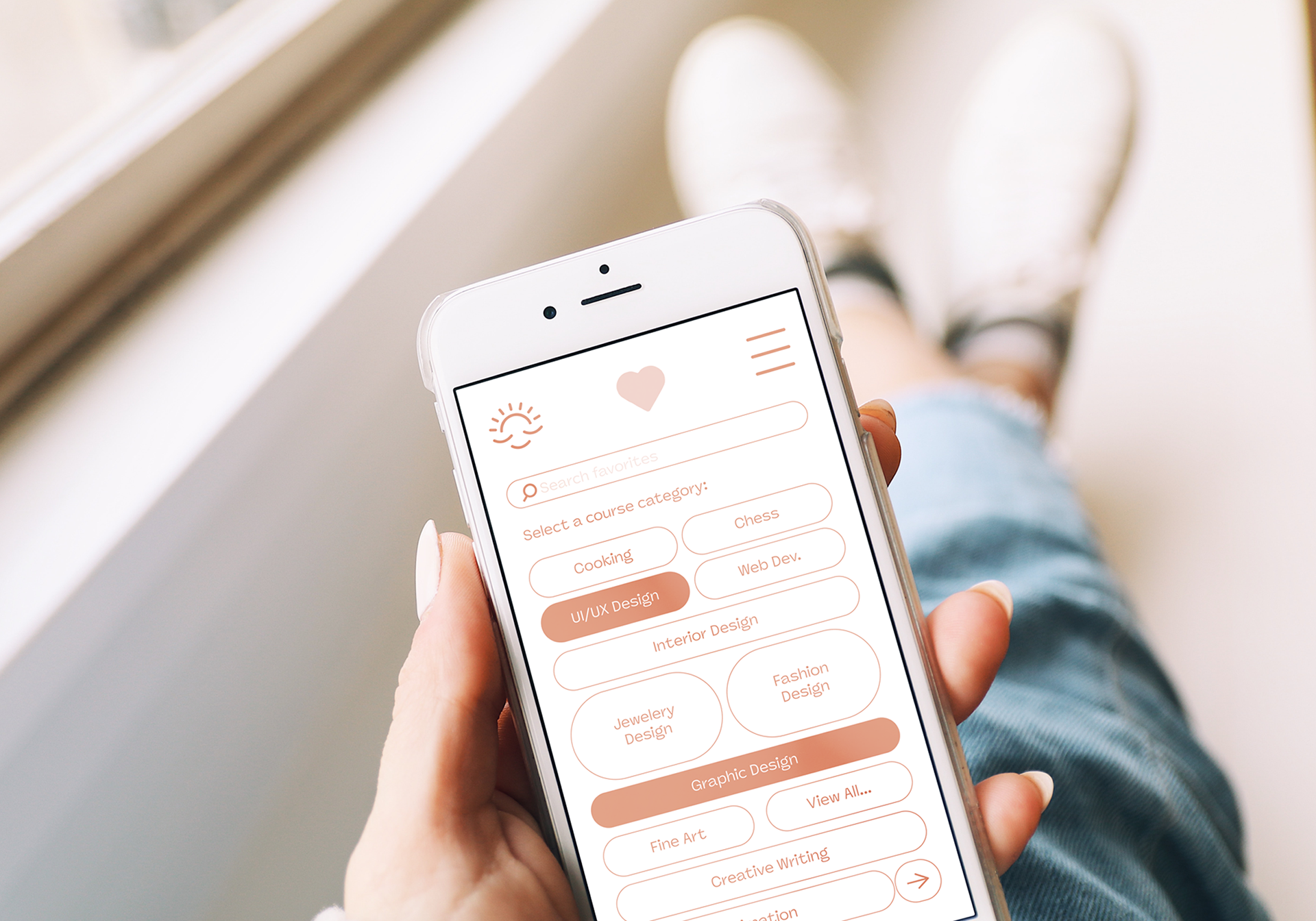
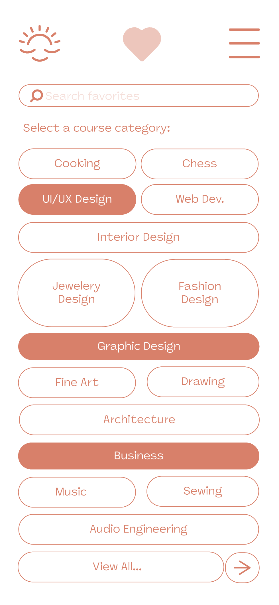
UI/UX design of a page on the brand's app, The overall user experience design of their app is made to be clean and simplistic with an easy-to-use interface.
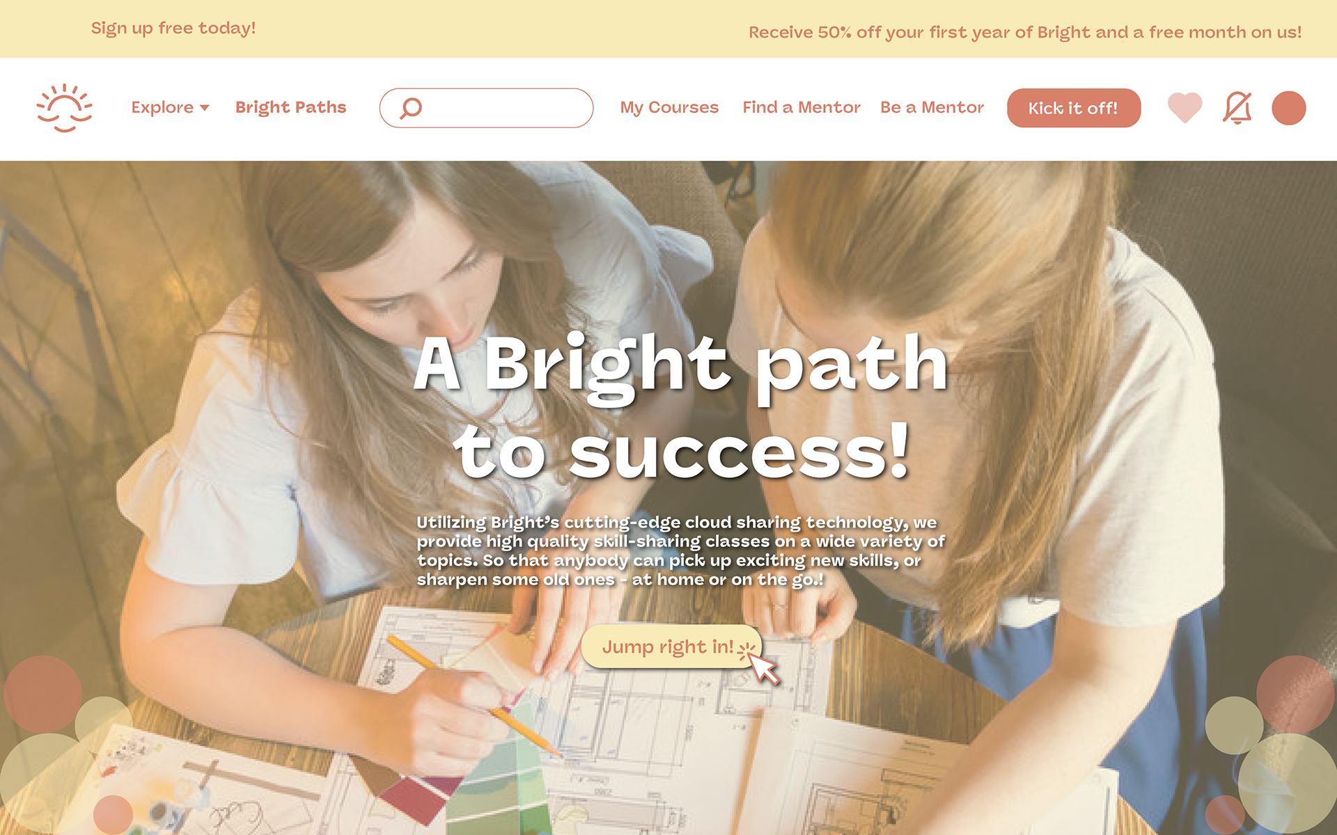
Here is a mockup design of the brand's website homepage. Similar to the app, the overall user experience design of their website is made to be clean and simplistic with an overall easy-to-use interface. The larger canvas is perfect for eye-catching banners!


Thanks for your appreciation!